
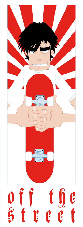


figured I was gettin a little tired of just doing a lot of pen drawings so I've been hittin' freehand pretty hard and it's refreshingly fun. Colour can sometimes make the difference! This is justa couple of colour muck arounds for potential shop stickers.....
Sunday, July 9
skateshop stickers?
Subscribe to:
Post Comments (Atom)


7 comments:
heh heh, yeh I know you ain't big on that type! It was there so I used...for now. I'd say I'd use a cleaner font rather than the one in the mural but still sorta organic if that makes any sense at all?
yeah the red/black is the strongest...
but the top left blue is nice too.
john.e
sweet. diggin the red and white one in the top right.
Yeah, the red ones are the best, for my two yens worth. Of course I am quite partial to the rising sun motif.
I see what NZ says about the type. I would work on refining the original hand drawn type you had, so you can literally fit it in with the illustration.
I am worried that if a skate shop sees the Olde' English / teutonic style font they will cream themselves and insist that you use it.
yeh you're right about the type.....and yeh I did choose that type face originally as it did seem to correlate with a whole bunch of other merch in the store, and yeh they prob would use it! If these ideas progress any further I'll refine the type that appears on the mural more and see how it fits down there....
Post a Comment